- Which is the best font for resumes in 2025? – A quick answer
- Why do resume fonts matter?
- Top 9 best fonts for your resume
- The worst font for resumes
- What is the right font size for resume?
- How to choose the best font for your resume
- How to choose a resume font for your industry
- Serif vs. Sans Serif - Which is better for a resume?
- Resume formatting tips
Wondering what the best font for a resume is? It is more important than you think.
At Naukri.com, we analyze thousands of resumes daily, and we have seen firsthand how font choice impacts readability, recruiter perception, and even ATS compatibility.
A poorly chosen font can make your resume hard to scan—or worse, get it filtered out before a recruiter ever sees it.
In this expert guide, we’ll walk you through the 9 best resume fonts for 2025 that both Applicant Tracking Systems (ATS) and human recruiters love.
Which is the Best Font for Resumes in 2025? – A Quick Answer
After evaluating industry trends and hiring patterns, our experts at Naukri.com recommend these top resume fonts for 2025:
- Calibri
- Arial
- Georgia
- Cambria
- Times New Roman
- Garamond
- Verdana
- Trebuchet MS
- Aptos
Why do Resume Fonts Matter?
Your resume font might seem like a minor detail, but it plays a big role in making a strong first impression.
Recruiters often spend just 6–7 seconds scanning a resume
And if the font is hard to read, cluttered, or unprofessional, your application may get ignored.
Additionally, many companies use Applicant Tracking Systems (ATS)
It can misread or reject resumes with overly stylized fonts. If this happens, your CV might never even reach the HR’s table.
Well-chosen resume fonts can help you –
- Make a strong first impression
- Avoid rejection by Applicant Tracking Systems (ATS)
- Increase the chances of reaching a recruiter’s desk
- Improve readability on both digital screens and print
- Increase your chances of being shortlisted for an interview
Top 9 Best Fonts For Your Resume
The right font makes your resume easy to scan, while the wrong one might get overlooked. So, here are the top 9 best resume font examples, carefully selected based on –
- Readability
- ATS compatibility
- Recruiter preferences
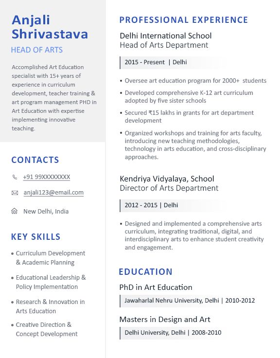
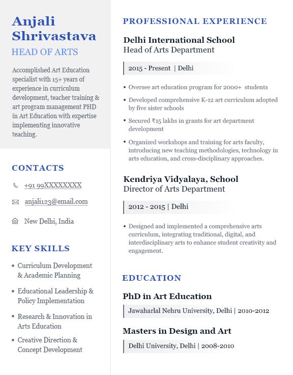
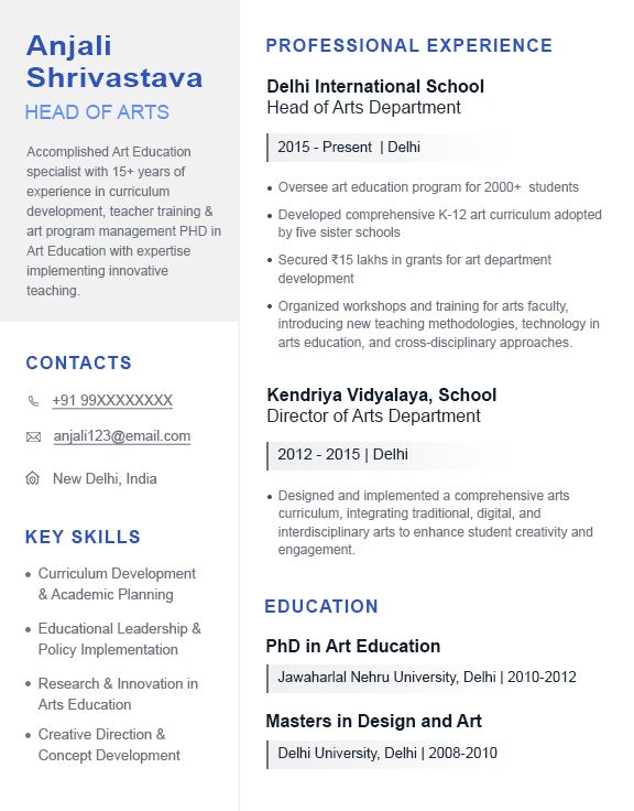
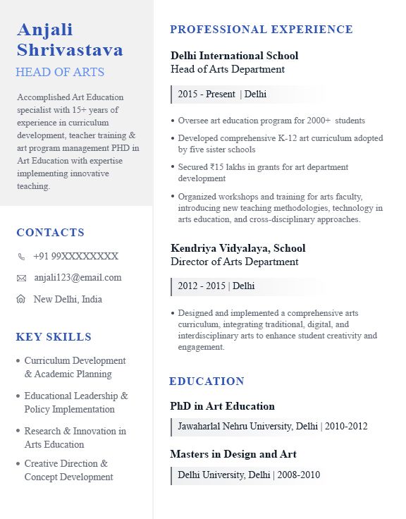
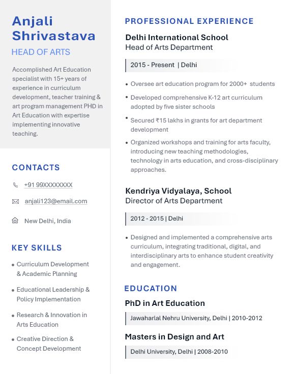
1. Calibri
Calibri is a modern sans-serif font introduced in 2007 as the default typeface for Microsoft Office. It has rounded edges and consistent spacing, making it readable on screens and in print.
- Why it works: The clean structure makes scanning easier, especially for recruiters reviewing multiple resumes quickly. It looks polished without being distracting.
- Best font for: Corporate roles, IT, law, and finance professionals.
- Pros: ATS friendly and widely recognised throughout sectors.
- Cons: Overused, so it doesn’t help a resume stand out visually.
Here's how the Calibri font looks on a resume:
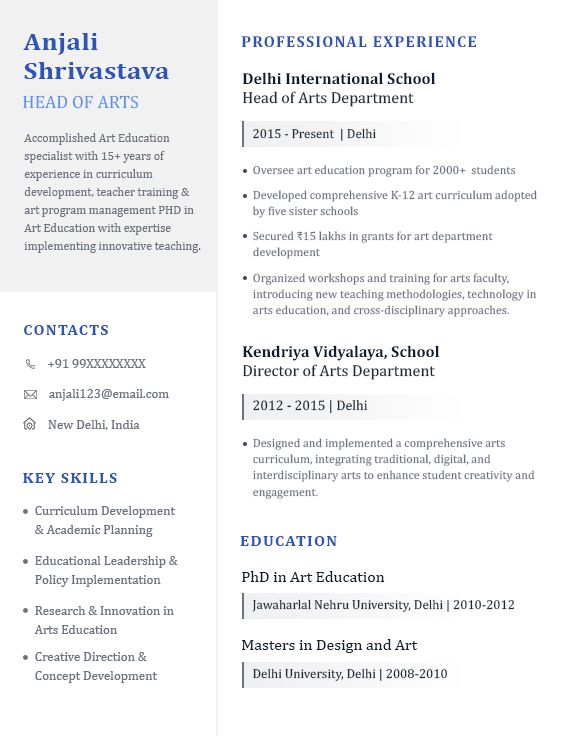
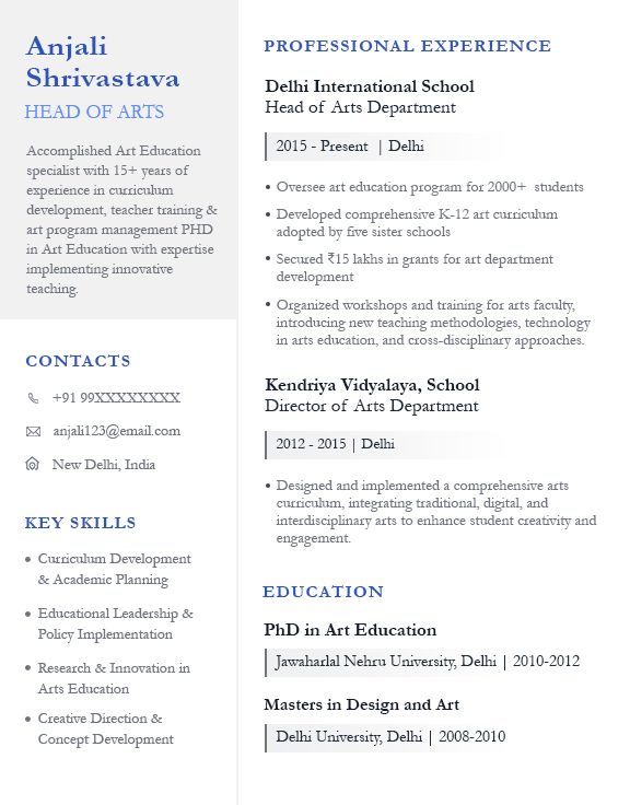
2. Cambria
Designed specifically for on-screen readability, Cambria is a serif font with a balanced, structured look. It feels professional while still being approachable.
- Why it works: The thicker letter shapes and ample spacing make it easy to read, even at smaller font sizes. Great for text-heavy resumes.
- Best font for: Consulting, education, and management roles.
- Pros: Professional yet modern, making it a solid choice for formal industries.
- Cons: Can feel too rigid or old-fashioned in creative industries.
Here's how the Cambria font looks on a resume:
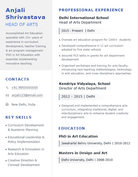
3. Georgia
Designed in the 1990s for maximum screen readability, Georgia is a serif font. It presents a bold, powerful style without feeling out of current.
- Why it works: The bold letters and slightly larger size make it easier to skim. Great for resumes with detailed sections.
- Best font for: Journalism, academia, law, and editorial roles.
- Pros: Easy to read, even in dense text formats.
- Cons: Can appear too traditional for design or tech roles.
Here's how the Georgia font looks on a resume:
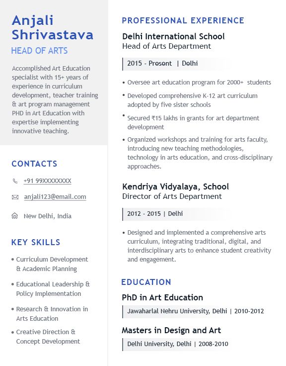
4. Arial
Arial is a widely recognized sans-serif font that is simple and functional. It is often used in business documents due to its neutral, readable structure.
- Why it works: The simple, no-frills design allows recruiters to focus on content without distractions. Works across all digital and print formats.
- Best font for: Business, administration, customer service, and healthcare roles.
- Pros: ATS-compatible and readable across all devices.
- Cons: Lacks personality and can make resumes look generic.
Here's how the Arial font looks on a resume:
5. Times New Roman
For many years, professional writers have used the serif font Times New Roman. For resumes in conservative industries, it is a safe, conventional option.
- Why it works: Compact letterforms allow more content per page without sacrificing readability.
- Best font for: Legal, finance, government, and academic professions.
- Pro: Universally recognized, making it a safe choice for conservative fields.
- Con: Overused and can make resumes look outdated in modern industries.
Here's how the Times New Roman font looks on a resume:
6. Garamond
Garamond is a serif font known for its elegant and slightly old-fashioned appearance. It looks sophisticated, making it ideal for detailed resumes.
- Why it works: Uses space efficiently while keeping text readable. Works well for longer resumes without feeling cramped.
- Best font for: Publishing, writing, education, and research roles.
- Pros: Gives resumes a well-organized look.
- Cons: Can appear less modern compared to sleek sans-serif fonts.
Here's how the Garamond font looks on a resume:
7. Verdana
Modern sans-serif font Verdana has strong strokes and wide letter spacing. This makes reading this font on screens one of the most pleasant ones.
- Why it works: The spacing reduces eye strain, making it an excellent choice for resumes sent online.
- Best font for: IT, customer service, and administrative roles.
- Pros: Readable at any size, making it a great fit for digital resumes.
- Cons: Takes up more space, limiting how much text fits on a page.
Here's how the Verdana font looks on a resume:
8. Trebuchet MS
Trebuchet MS is a savant sans-serif font with a modern and approachable feel. Its curved letterforms make it unique while maintaining clarity.
- Why it works: It has slight curves that make text look engaging without losing clarity. Works well for resumes where a personal touch matters.
- Best font for: Non-profits, media, public relations, and customer service.
- Pros: A good balance of creativity and professionalism.
- Cons: Might feel too informal for high-level corporate jobs.
Here's how the Trebuchet MS font looks on a resume:
9. Aptos
Aptos is Microsoft’s new default font, designed to be a modern, accessible replacement for Calibri. It has a sleek, adaptable style that works well for resumes.
- Why it works: The fresh, modern appearance makes resumes look updated while remaining easy to read.
- Best font for: Startups, technology, and corporate roles.
- Pros: ATS-friendly and gives a resume a contemporary edge.
- Cons: Still new, so some recruiters may not be familiar with it.
Here's how the Aptos font looks on a resume:
The Worst Font For Resumes
Some resume fonts look unprofessional and are hard to read, hurting your chances with recruiters. So, avoid these fonts:
- Comic Sans – Too childish and informal.
- Papyrus – Looks unprofessional and outdated.
- Brush Script – Difficult to read, especially in small sizes.
- Courier New – Typewriter-style, feels outdated.
- Impact – Too bold, making resumes hard to scan.
What is the Right Font Size for Resume?
Font size is just as important as font selection.
Recommended Font Sizes
- Your Name: Should be the most noticeable, around 18–22 pt to stand out.
- Headings: Use 14–16 pt to keep section titles clear and structured.
- Body Text: Stick to 10–12 pt for readability without straining the eyes.
How to Choose the Best Font for Your Resume
Here are a few resume font selection tips to help you choose the right font type, style and size:
- Prioritize readability – Stick to clear, professional fonts like Calibri, Cambria, Arial, or Georgia. Avoid decorative or script fonts that are hard to read.
- Check ATS compatibility – Some fonts confuse Applicant Tracking Systems (ATS), which may reject your resume. Safe choices include sans-serif and traditional serif fonts.
- Consider the industry – Use classic fonts like Times New Roman or Garamond for law and finance jobs, while Aptos work well for tech and creative fields.
- Choose the right size – Keep the body text between 10–12 pt for easy readability. Use 14–16 pt for headings to create a clear hierarchy.
- Test on different devices – Print and view your resume on multiple screens to make sure it remains clear and well-structured.
How to Choose a Resume Font for Your Industry
A well-chosen font helps your resume match industry expectations while staying professional and readable.
Serif vs. Sans Serif - Which is Better for a Resume?
Serif fonts (e.g., Times New Roman, Garamond) have small decorative strokes, giving a traditional and formal look.
Sans-serif fonts (e.g., Arial, Calibri) are clean and modern without extra details.
For most resumes, sans-serif fonts are better as they are easier to read on screens and ATS-friendly.
Resume Formatting Tips
Choosing the right resume font is just the first step. Proper formatting is equally important to create a strong impression. Here are some key tips to help you:
- Choose the right resume format.
- Use 1-inch margins and a single-column format for clarity.
- Keep it concise—one page is ideal.
- Align text to the left for easy scanning.
- Use bold or italics for key details.
- Save as a PDF to maintain formatting.
- Avoid excessive colours or graphics for a professional look.
Wrapping up
So, these are the 9 best fonts for your resume in 2025. Choosing the right font helps your resume look professional, readable, and ATS-friendly, increasing your chances of getting noticed.
Quick recap:
- Pick clear, professional fonts like Calibri, Arial, or Georgia.
- Avoid decorative or hard-to-read fonts.
- Choose 10–12 pt for body text and 14–16 pt for headings.
- Match your font to your industry’s expectations. Need a resume that grabs attention? Build and upload yours on Naukri.com today to connect with top recruiters!
FAQs
What is the best font for a resume?
The best font for a resume depends on personal preference and industry norms. Generally, popular choices include Calibri, Arial and Times New Roman. These fonts are known for their readability and professionalism.
What is the best font for an engineering resume?
For an engineering resume, it's important to choose a font that is clear, professional, and easy to read. Common choices include Arial and Calibri. These fonts convey a modern and technical aesthetic suitable for engineering roles.
What is the best font for a WSO resume?
WSO (Wall Street Oasis) resumes often require a font that exudes professionalism and sophistication. Classic serif fonts like Times New Roman or Garamond are popular choices for WSO resumes. These fonts convey a traditional and conservative appearance, which may align well with the finance industry.
Is Calibri good for a resume?
Yes, Calibri is considered a good font for resumes. It is a modern sans-serif font known for its readability and clean appearance. Calibri is widely accepted in professional settings and is compatible with Applicant Tracking Systems (ATS), making it a popular choice for resumes.
